Making the Most of Monochrome
Well I’m kicking off 2022 working with Bernadette Meyers from Breeze Pics! We want to help you feel confident in selecting artwork you will love to have in your home, and help you bring each space together.
Bringing a monochrome artwork into your home offers a number of options when styling.
Subtle or High Contrast
The artwork can be soft and subtle creating a calming effect, or it can be a high contrast piece that is quite striking, creating completely different moods within a space. However in each case, monochrome works offer the opportunity to style them in different ways.

‘Winter Serenity’ by Bernadette Meyers
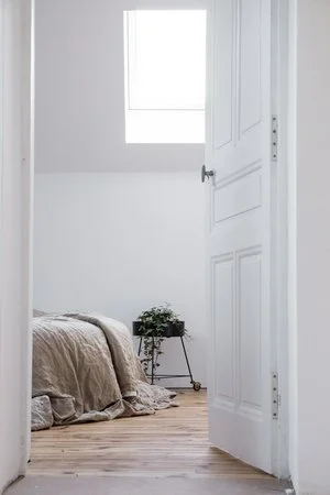
Such a striking use of black and white, perfect for a monochrome lounge room. Picture a warm timber frame above a neutral coloured couch, black and a white textured cushions, a fiddle leaf fig tree in a black pot off to the side, and of course - the fire blazing on a cold day.
Picture Your Scene
If you are looking to keep to the striking combination of black and white, then complement it with the natural greenery of plants, and the warmth and texture of timber. You can also pick up on patterns and textures through decorative accents, cushions and fabrics, to tie the look together.
‘Sasch on Skates No. 2’ by Joanna Greenwood
The use of movement in this piece was telling the story of the subject matter. A well used pair of Sasch’s roller derby skates. Those puppies had seen so much action and fun, it was a must to try to convey this about them, and about Sasch. This piece can pick up on the black highlights in a room, be styled above a couch with some touches of black in the cushions or a throw. And if you have an accent colour already established it’s no problem with this piece.
Complements any Style
Working with monochrome artworks also offers the option of injecting colour within a room as they pair nicely with any colour or style combination. For example, you can take a more contemporary approach to the Hamptons style with a monochrome ocean print, paired with the blues usually seen within that style. Or conversely, you could pair a softer piece within an all white space to add to the calm mood that style creates.

‘Wispy Seeds No. 14’ by Bernadette Meyers
Oh Wispy Seeds, how I love you! This absolute stunner is a styling dream. The quiet and light mood it creates is just what you need to come home to after a long day. It is such a versatile piece I can pretty much imagine its beauty in any room. A dreamy delight above a bed - intentionally off centred, or together with its partner (see Breeze Pics for more details). And the best part? You could frame this baby in black for something more striking, keep it neutral in a white frame in an all white room, or add warmth with a timber one. All pluses from me.
Pairing With Colour
Monochrome works can also be a great benefit if you have already highlighted a colour within a room through textiles or paint colours, as they wont clash with what you have within the room. It can also mean that the piece can be used in a variety of rooms, which offers you the opportunity to ‘restyle’ your home while using your most loved artworks.
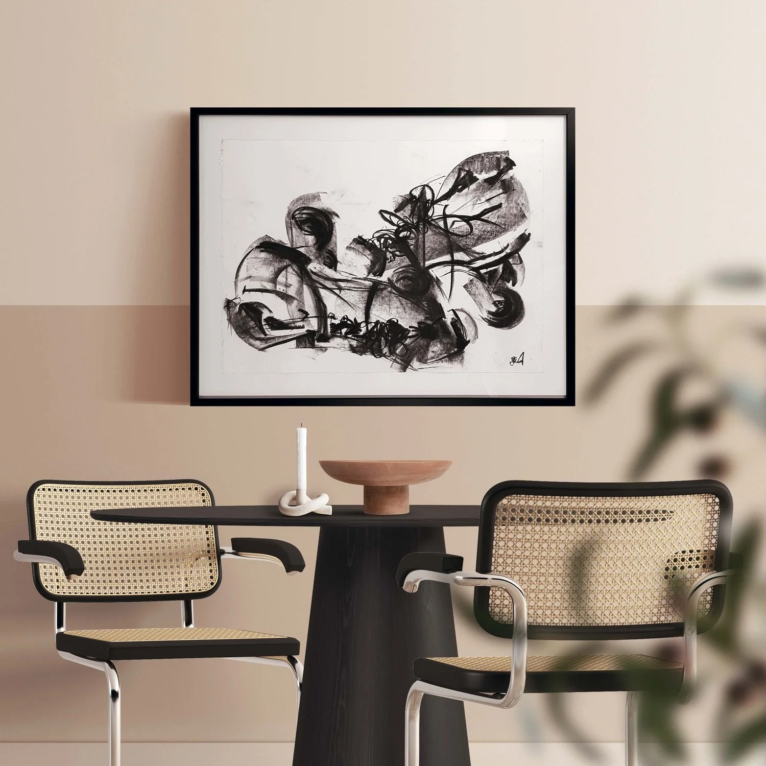
‘Empty’ by Joanna Greenwood
This piece was drawn from pure emotion using highly contrasting strong mark making. It is such an easy piece to work into a space. It’s energetic and edgy and offers the opportunity to highlight a pop of colour. Picture it leaning on a sideboard with a single monstera leaf in vase and some books. Or a burnt orange, burgundy, and muted pink floral arrangement as an eye catching pop of colour.
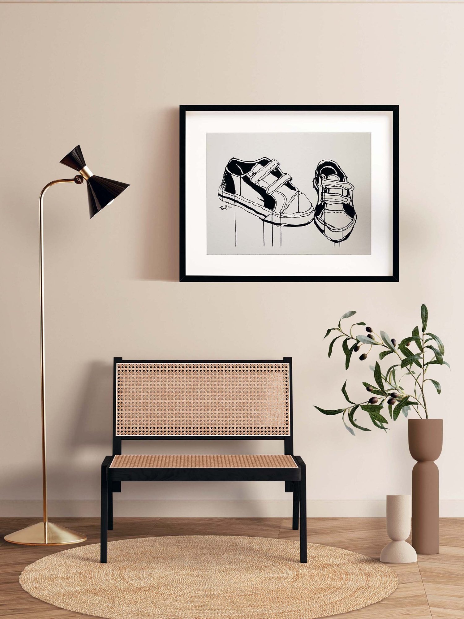
‘Velcro’ by Joanna Greenwood
Keeping it energetic, this little guy could easily be styled into a teenage bedroom, an office, or an edgy reading nook with no trouble at all. Its simplicity creates a contemporary vibe with the option of pairing it with any colour.
Take inspiration from…
It is always a great start to take inspiration from something you love, whether it be a new artwork, or something you have collected on your travels. For monochrome - from this starting point - you can pick up on shades, tints and tones (darker, lighter, and more grey) from your most loved piece, and tie them in through the whole room. This not only creates a cohesive look, but lets the point of inspiration be uniquely yours within your home.

‘Wispy Seeds No. 9’ by Bernadette Meyers
Soft and subtle, this piece is extremely versatile. It would be beautiful in an entryway above a timber or black textured sideboard or bench seat. As it’s inviting, open, and calming it would also be stunning in a bedroom or study.
Next Steps…
So have a think about what sort of mood you want to create within each space. Think about what you have already that you love and want to tie into a particular room.
If you really love a piece, you will look at it multiple times because you just won’t be able to help yourself. That is the beauty of investing in artwork. It will make you love to come home.
If you need a hand pulling things together, or even just some guidance in selection, get in touch. We would be so happy to help.
For more inspiration, download our monochrome catalogue.

‘Gentle Magnolia’ by Bernadette Meyers
What a gorgeous close up of a favourite flower for styling. Magnolia is perfect for styling even when it’s not flowering. And this art piece would be a beautiful way to add that floral element to your home without having to have fresh flowers. Pairing this with a soft plant nearby, I’m picturing an oversized armchair in white or wheat, a soft black linen cushion, a white terrazzo topped side table for a cuppa, and my favourite book.
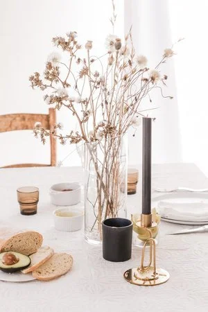
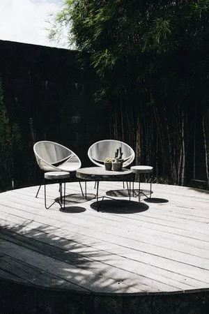
Inspirational Images